Case Study: Nibble Health. Brand Identity and UX Design for Healthcare Fintech Service
Case Study: Nibble Health
Brand Identity Design
- Nibble Health is a fintech service that eliminates financial barriers to healthcare by offering buy-now-pay-later options for out-of-pocket expenses.
- The brand identity aims to be welcoming, friendly, reliable, and helpful.
- The typography choice is Object Sans, a contemporary type family that works well in both print and digital contexts.
- The logo is a combination mark with a solid brand name and a symbol representing nibble parts.
- The logo is flexible and can be used in different color combinations within the brand color palette.
- An animated version of the logo was created for digital communication.
- The color palette for social marketing communication was developed.
- Consistent branded elements were created, including business cards, advertising graphics, social media templates, and merch.
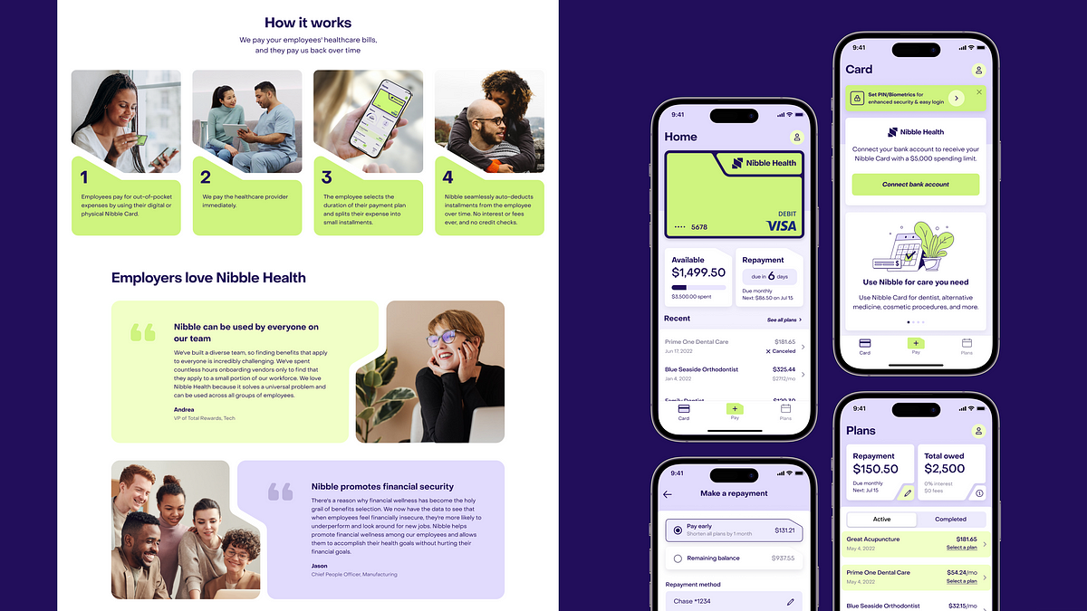
UX Design
- The user experience design process included website design and product design for the mobile application.
- The same visual approach as the brand identity was applied to the mobile application interface.
- The user interface design is straightforward, intuitive, and covers different user scenarios.